

Journal
The
Branding
There’s a moment when writing stops feeling natural and starts feeling strangely performative – even when you know what you’re trying to say. That isn’t self-doubt. It’s a disconnect.
Brand basics don’t have to feel overwhelming. If branding has started to feel heavier than it should, this piece explains the quiet clarity that steadies decisions – and why everything gets easier once it’s in place.
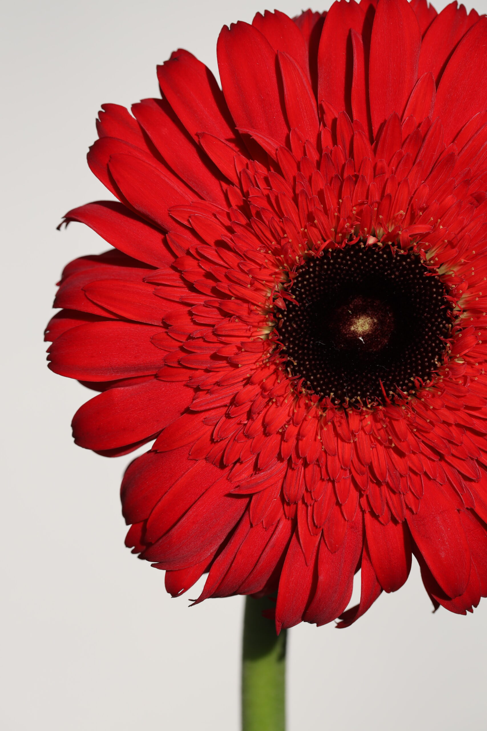
Most image advice focuses on what looks good. This starts earlier – with what your brand is actually here to say. Because visuals don’t decorate clarity; they either reinforce it or erode it.

Your website images may be good – even beautiful – and still feel wrong together. When visuals don’t quite land, the issue is rarely quality. It’s something more structural than you might think.
TRENDING

FREE DOWNLOAD
Elevate Your Brand In a Few Simple Steps
Finally: free templates plus a guide that helps make them look and feel like you.
GET THE BRAND RX
ABOUT the Author
I’m Kathy – Founder, designer, rebel, and the woman behind every word you’ll find here.
I write about design, branding, and the behind-the-scenes thinking that goes into making your online presence feel intentional vs “I hope this works.” From fonts to images to platforms to templates – if something shapes how you show up, I’ve probably overthought it and have something to say about it here.

READ MY STORY


Most LOVED

Free Winter Canva Templates

Coming Soon
Find Your Next Favorite

The RX Design Lab
Why Showit? Read This First
The Rêveaux Resource Toolkit
2.
The Showit Support Library
3.
Coming Soon


Instagram
I'm baby green juice lo-fi blue bottle prism vice beet salad.
Follow Along
TikTok
Nonexistent juice lo-fi blue bottle prism vice literally coffee.
Let's Get Casual
The Shop
Prismacolor juice lo-fi blue bottle prism vice literally migas.
Find Your Match